It’s nice to imagine that anyone who visits your website is halfway to becoming a customer. In reality, most people are showing just the first glimpse of interest.
To turn these prospects into clients, you will need to take their hand and guide them all the way through your marketing funnel.
A lead generation landing page can play an essential role in convincing visitors to come along for the ride. But what exactly is the purpose of such a page, and how do you build one?
In this guide, we’re going to reveal all and take a look at some top-performing examples.
What Is a Lead Generation Landing Page?
A lead generation landing page is a custom page on your website that is designed for prospects who are learning about your business, product, or service for the first time.
These pages are often used in combination with social media posts and online ads. When a user clicks on “learn more,” they are almost always taken through to a lead generation landing page.
The primary purpose of such pages is to turn a visitor into a qualified lead. This can be achieved with something relatively simple — the offer of an enticing lead magnet in exchange for an email address, for example.
Other landing pages are more detailed, delivering a wealth of information or a full sales pitch.
Why Do You Need Lead Generation Landing Pages?
Any page that brings qualified leads through your door is beneficial. But the benefits of a good landing page extend way beyond the first contact.
A well-designed page can help you:
- Sell – hitting new visitors with a concise, targeted pitch can accelerate the sales process
- Educate – you can answer common questions and snuff out concerns before they have a chance to take root
- Earn email subscribers – most landing pages encourage users to join a mailing list, opening the door to email marketing
- Get more signups – SaaS businesses can use landing pages to promote a freemium model
These are just some of the many reasons why landing pages are so valuable in lead generation.
10 Best Practices for Building Lead Generation Landing Pages
In many respects, a landing page is like a phone call: you have only a few seconds to get someone interested.
For this reason, it’s important to think carefully about every aspect of your landing pages — from the design through to the content and CTA (call to action). Here are some best practices that should put you on the right path:
1) Make It Punchy
When designing a landing page for lead generation, it’s helpful to bear in mind that visitors may only have a passing interest in your product or service. In other words, you need to grab their attention as soon as possible.
This starts with a strong headline — a tagline that quickly sums up the offer you are making. If possible, use attention-grabbing words like “new,” “free,” and “instantly.” You can add some extra detail with a subheadline.
Your body text should ideally follow the same formula, but keep it concise. Bullet points are preferable to a lengthy paragraph. If you want to expand on certain ideas, do it further down the page.
2) Focus Above the Fold
In web design, “above the fold” refers to everything that is visible to the user without scrolling. This area is particularly important on a landing page.
When your landing page loads, most visitors will quickly scan what they can see. In those first few seconds, they are working out whether the offer is relevant to them.
When you design your landing pages, make sure to put all the key elements above the fold: the headline, important benefits, a featured image, and your call to action.
The only thing you shouldn’t include anywhere on your landing page is navigation. The last thing you need is visitors wandering off to explore your site, and forgetting to take up your offer!
3) Talk About Benefits, Not Features
Ever watched Wolf of Wall Street? In that brilliant movie, there is a famous scene where a talented salesman is asked to demonstrate how he would sell a pen.
“Write your name down on that napkin,” he says. Of course, no-one has a pen to hand.
This perfectly illustrates how you should write for your landing page. Don’t focus on features, talk about benefits. How will your offer help a prospective client? The answer should inspire your pitch.
4) Create a Compelling CTA
If you manage to catch the attention of a visitor, it is very important to press home your advantage. On a landing page, this means using a clear and compelling call to action.
Need some inspiration? Here are some frequently used examples:
- Download your free white paper
- Sign up today
- Start your 30-day free trial
- Subscribe now
- Schedule a demo
- Save your space
You can include your call to action more than once on a landing page, or use a pop-up. Just be careful not to make it annoying.
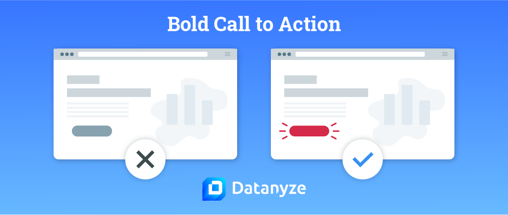
The design of your CTA is also important. This should be the boldest, brightest element on the entire page. Choose a color that contrasts with the background; red is a favorite, because it has the psychological effect of promoting urgency.
5) Keep Your Forms Simple
Pretty much every lead generation landing page includes at least one form. You might be tempted to add multiple fields to collect information about each prospect — but this is a major pitfall.
Remember that most visitors aren’t that engaged yet. Just getting them to put in an email address is a significant win.
Even if you want someone to sign up for a trial, the most you need is their name, their email address, their company name, and a password. Every extra field you add will increase the chances of leads bailing out.
6) Build Confidence
In comparison to making a purchase, submitting an email address might seem like a very small investment. But you might be surprised how protective people can be. In some cases, you may need to work quite hard to earn their confidence.
One way to win over visitors is by using “social proof.” This is any form of content that backs up your claims, but comes from someone else, such as testimonials and reviews.
Including a few choice quotes and ratings will enhance your credibility, and in turn, build trust.
7) Use Visuals
We have talked plenty about text in this list so far, but visuals are a key component of any lead generation landing page.
The human brain can process images in just 13 milliseconds. That’s much, much faster than you can read even a short phrase. For this reason, you should always include photos in your landing pages — and feature them prominently in the design.
If possible, select images that illustrate what your offer is about, and use photos of real people wherever possible. Science tells us that the mind recognizes faces much faster than objects.
8) Make It Fast and Mobile Friendly
Even if your landing page contains all the right content, you may lose potential leads if your page is slow to load or difficult to use on mobile devices.
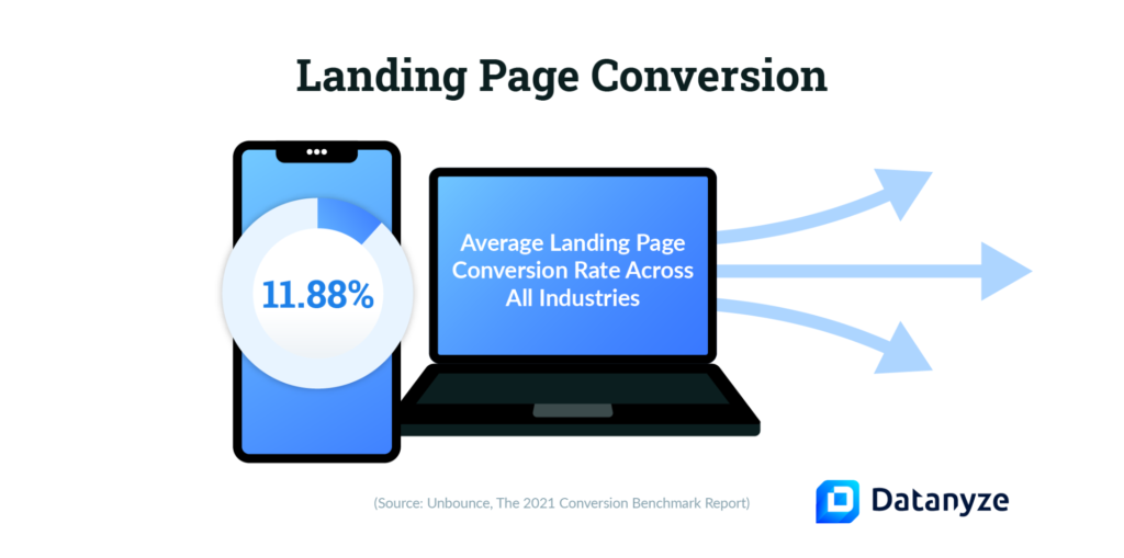
According to Google, 53% of mobile users will abandon a page if the loading time is more than three seconds. That is more than half of your potential leads gone.
To stop this happening, make sure to optimize your landing pages. Use a responsive design, and adapt the design for different display sizes. To increase the loading speed, minify your code, compress image files, and use caching.
9) Maintain Consistency
In all likelihood, your lead generation landing pages will be different from the rest of your website. They may even be hosted on a different subdomain or platform.
However, they should still represent your brand.
When you are choosing the content and creating the design, don’t stray too far from your own brand guidelines. Write a pitch with the same tone as other content on your website, and choose your usual brand colors.
Keeping this cohesion through the marketing funnel will help you maintain a professional appearance, which will give clients greater confidence in your brand.
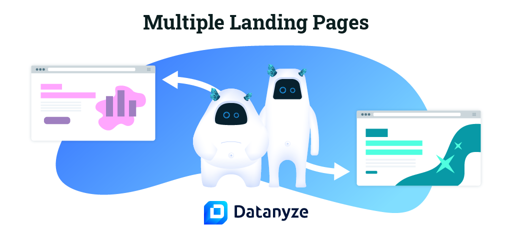
10) Segment Your Audience
While one landing page is better than none, you should probably aim to create many different lead generation pages.
Why? Because each page should be perfectly tuned for a specific buyer persona.
Many larger companies have more than 40 landing pages to cover all their products and target demographics. In some cases, the changes between these pages might be quite small — but the precision targeting ensures that every prospect sees a relevant pitch.
Bonus Tip: Use A/B Testing
Almost no-one builds a perfect landing page at the first attempt. The key to success is A/B testing. This is where you trial two variants up against each other to determine which one is more effective.
By repeating this process over and over again, you can let the numbers guide your design choices.
Top Examples of Lead Generation Landing Pages
When you come to build your next landing page, following the guiding principles mentioned above should serve you well.
However, you might be wondering what a good lead generation page looks like in the real world. To provide you with some inspiration, here are some top-performing examples:
WalkMe
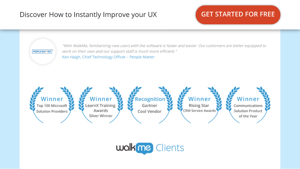
As a service that helps companies with digital adoption, WalkMe needs to cover several different audiences and solutions. One of these products is a system that explains any interface through tooltips.
The lead generation landing page for this UX solution is an example of textbook design. It includes a clear headline and subheadline, an animated gif that helps to illustrate the product, and a huge CTA in red.
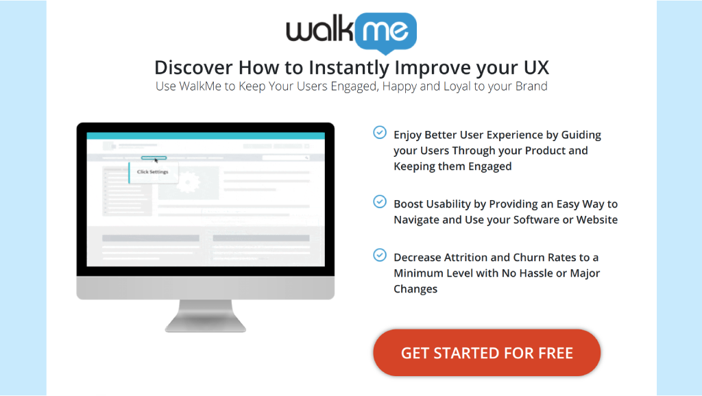
Credit: WalkMe
Below the fold, we see a glowing direct quote from a customer, and enough awards to fill a trophy cabinet.
Credit: WalkMe
Notice that the headline and CTA remain at the top of the page as you scroll, and there is no other navigation.
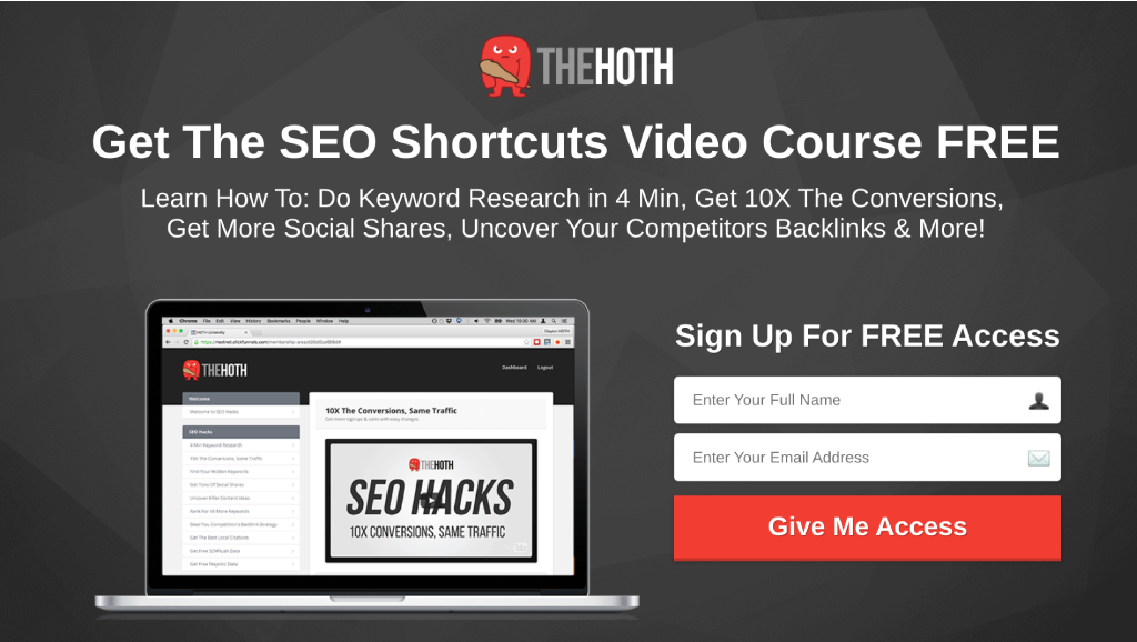
The HOTH
The brand name of this white-label SEO agency is a revealing acronym: “Hittem Over The Head.” You can see the philosophy at work in The HOTH’s lead generation landing pages.
Credit: The HOTH
There isn’t much subtlety in this design, but it gets the job done. The headline makes a compelling offer, and the subheadline talks about the benefits of taking the course.
We can also see a nice big form with just two fields, a huge red CTA button, and a simple image to illustrate the offer.
There is room for improvement with this one – there is no content below the fold, for example. However, The HOTH definitely nailed the fundamentals.
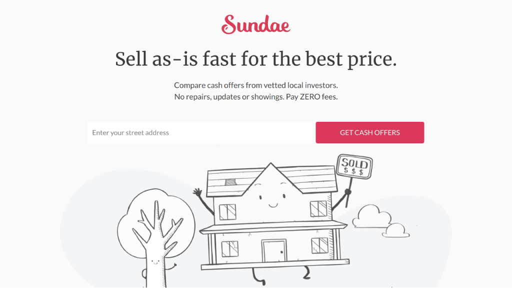
Sundae
This real-estate startup has a very clean landing page. The key benefits of using the service are covered in two short lines, and that big red call to action is unmissable. These features are backed up with a fun image.
Credit: Sundae
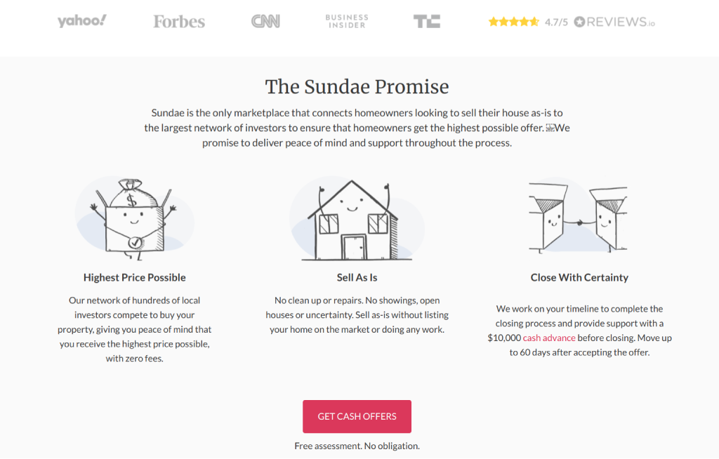
Directly below the fold, Sundae name-drops all the big media brands that have covered the product, and displays a favorable score from a review site.
Credit: Sundae
Notice that we have another bold CTA, and this one pulls visitors straight into the product.
Shopify
As a platform that helps people to start online stores, Shopify caters to many different businesses. The target for this landing page is dropshippers.
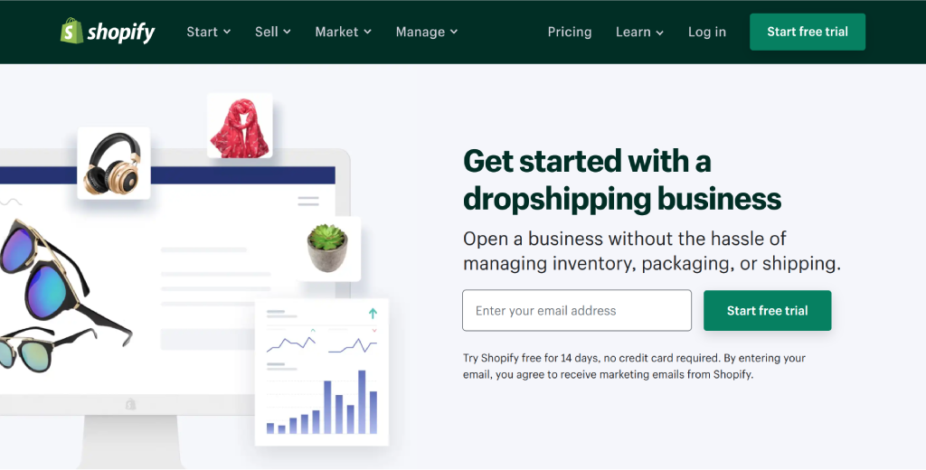
Credit: Shopify
The design includes a classic headline, subheadline, illustrative image, and email form. The CTA button is large and colorful, but not red. This is because green is a signature part of the Shopify brand.
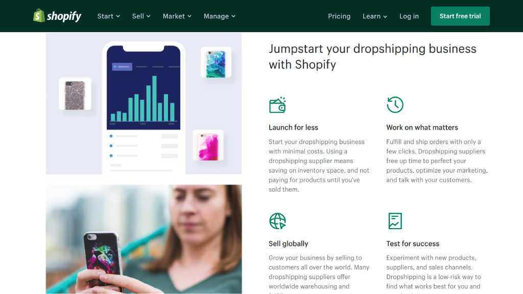
Credit: Shopify
As you scroll further, you come across deeper explanations of the key benefits, full customer testimonials, and even a comparison with other solutions.
Lead Generation Made Easier
No matter what industry you’re in, a good landing page can turbo-charge your inbound lead generation.
Want to get more leads from outbound marketing? Datanyze can provide contact details and vital information about any prospect from LinkedIn or any company website. Sign up free today to give it a try!